Writing a good image prompt can feel like filling in a Mad Libs story. Once you have a pattern, you just plug in the parts you want. That is what this guide gives you.
We will use a simple pattern for most image requests:
[Style] of [subject] in [setting], [composition], [lighting], [color palette], [lens or perspective], [detail level].
You choose the main actor, which is the subject, and the stage, which is the setting. Then, if you like, you can fine-tune the picture by filling in style, composition, lighting, color palette, perspective, and detail level. You can keep it very simple or get very specific.
In this article, you will see three things. First, a clear prompt pattern you can copy and reuse. Second, a short description of each part of the pattern, so you know what it controls in the final image. Third, you will see several complete example prompts plus long lists of options you can plug into each slot. You can treat it like a menu. Mix and match until you get the image you want.
Image Generation Prompt Pattern
[Style] of [subject] in [setting], [composition], [lighting], [color palette], [lens or perspective], [detail level].
Examples:
Photorealistic close-up of a ceramic coffee mug on a wooden table, morning window light, shallow depth of field, 50mm lens, soft shadows
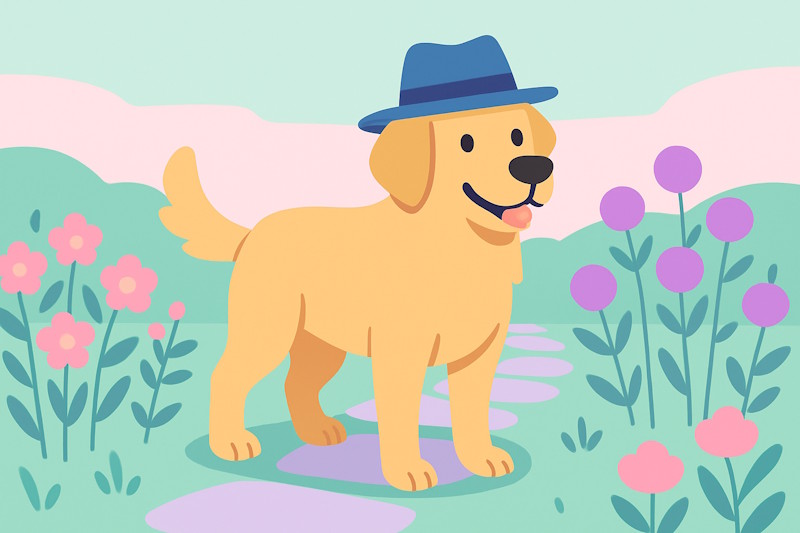
Flat vector illustration of a golden retriever wearing a blue fedora, simple shapes, high contrast, minimal background, SVG look.
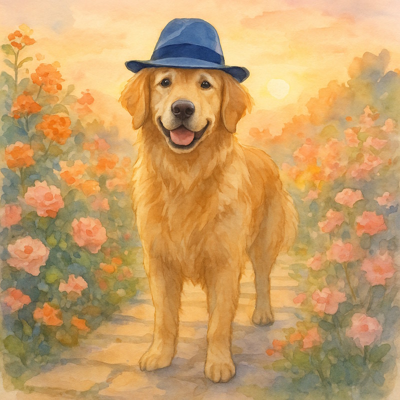
Watercolor painting of sunflowers in a mason jar on a windowsill, gentle washes, visible paper grain, light splatter.
3D render of a retro radio on a marble pedestal, studio lighting, global illumination, crisp reflections, high detail.
Cinematic film still of a cyclist on a foggy bridge at sunrise, low angle, backlight rim glow, shallow depth, film grain.
Image Creation Prompt Options
Prompt Template
[Style] of [subject] in [setting], [composition], [lighting], [color palette], [lens or perspective], [detail level].
You choose the actors (Subject) and the stage (Setting). Then, if you want, fine-tune the wardrobe and lights by choosing the Style, Composition, Lighting, Color Palette, Perspective and Detail Level.
How to use this in Practice
Using this prompt template gives you the power to control the output, beyond just asking for a subject. In the examples below, we’ll use the same subject, but alter the other elements accordingly.
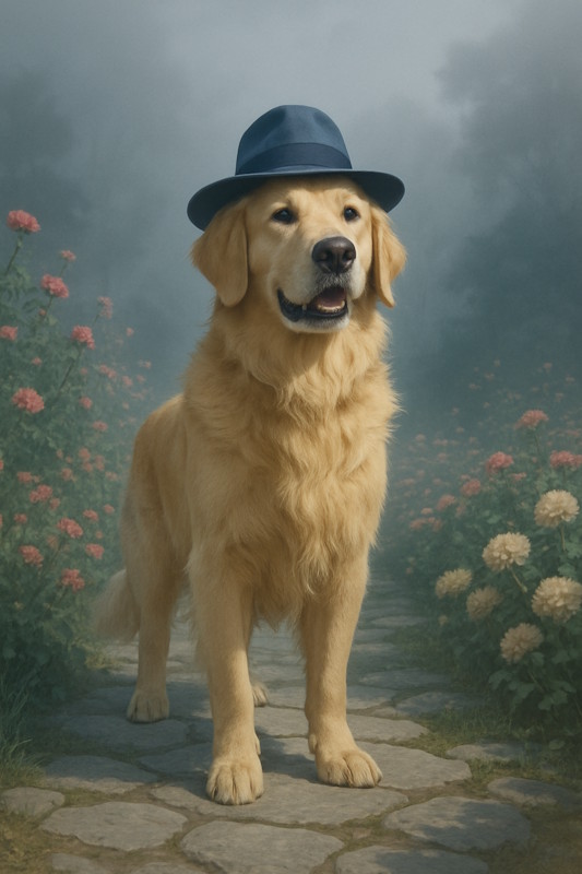
The Subject: A friendly golden retriever wearing a blue fedora, standing in a flower garden along a stone path
Flat vector illustration of a friendly golden retriever wearing a blue fedora, standing in a flower garden along a stone path, Rule of Thirds Subject, Overcast sky softbox, even light, Candy pastels of pink, mint, and lavender, Eye level three quarter view, Clean vector edges.Photorealistic image of a friendly golden retriever wearing a blue fedora, standing in a flower garden along a stone path, Foreground Anchor, Midday sun hard light, crisp shadows, Cozy warm tones of amber and rust, Low angle looking up, High detail with textures.Oil painting of a friendly golden retriever wearing a blue fedora, standing in a flower garden along a stone path, Off Center Tension, Sunset peach and gold, romantic light, Jewel tones emerald, ruby, sapphire, Seated eye level view, Detailed shading and highlights.Watercolor painting of a friendly golden retriever wearing a blue fedora, standing in a flower garden along a stone path, Centered Subject, Golden hour backlight, soft shadows, gentle glow, Sunrise pastels of peach, blush, and sky, Eye level view, Medium detail.Cinematic film still of a friendly golden retriever wearing a blue fedora, standing in a flower garden along a stone path, Wide Establishing, Foggy light with haze, soft edges, Stormy blues and grays, Low angle hero shot, High-res 4K sharp look.
Important Note
There is a lot we left out. Notice the shape of the images is different, as well as the exact elements in the composition? The types of flowers, where the dog is looking, the type of stones in the path, all of these are details left to the AI. Keep this in mind when you make your own images. What you don’t specify, the LLM will decide, seemingly at random.
Try These Elements In Your Image Creation Prompts
Below is a large set of samples to plug into the prompt template so you get the image you want. This is not a complete list by any means. You can always ask your AI assistant for ideas or refinement.
Style
Photographic looks
Photorealistic – Looks like a real photo. Great for products, portraits, food.
Editorial magazine – Crisp, styled images that feel like a magazine spread. Good for fashion or features.
Lifestyle candid – Natural, in-the-moment shots. Useful for everyday scenes and people at home.
Street photography – Gritty, real-world scenes. Good for city stories and human moments.
Documentary reportage – Honest, unposed coverage. Use for events, travel, and cause-based stories.
Macro close-up – Extreme detail of small things. Great for flowers, textures, and tiny parts.
Black and white classic – Timeless look that removes color distractions. Good for mood and texture.
Cinematic and film looks
Cinematic film still – Movie-style framing and light. Great for storytelling and drama.
Golden hour glow – Warm, soft light near sunset. Perfect for portraits and landscapes.
Film noir – High contrasts with deep shadows. Good for mystery and vintage mood.
High key bright – Very bright with soft shadows. Useful for cheerful, clean subjects.
Low key dramatic – Dark tones and focused light. Great for suspense and strong shapes.
35mm grain – Visible film grain and slight fade. Good for retro realism.
Polaroid instant – Square frame with instant-photo feel. Nice for casual, nostalgic notes.
VHS retro – Soft focus with tape artifacts. Fun for 1980s and home-video vibes.
Traditional art media
Oil painting – Rich color and brush texture. Good for portraits and classic scenes.
Watercolor painting – Soft edges and paper texture. Nice for greeting cards and book art.
Acrylic painting – Bold color with quick-dry look. Great for posters and modern art.
Pastel drawing – Soft, chalky blends. Good for gentle portraits and skies.
Charcoal sketch – Rough lines and deep blacks. Great for studies and moody scenes.
Pencil sketch – Simple lines and shading. Useful for drafts, plans, and notes.
Ink wash – Fluid grays from watered ink. Good for moody landscapes and portraits.
Pen and ink line art – Crisp lines and hatching. Ideal for diagrams and black-and-white comics.
Illustration and graphic design
Flat vector illustration – Clean shapes and solid colors. Ideal for icons, posters, and infographics.
Isometric vector – 3D-like angle without perspective. Useful for maps, dashboards, and scenes.
Line icon set – Thin strokes and simple forms. Good for UI and quick labels.
Cartoon comic – Bold outlines and expressive faces. Great for humor and kid-friendly pages.
Children’s book – Warm, friendly art. Perfect for simple stories and teaching.
Editorial illustration – Concept art for articles. Good for abstract ideas and think pieces.
Crafted and printmaking
Paper cutout – Layered paper shapes and shadows. Great for classroom looks and crafts.
Woodcut print – Strong black shapes with carve marks. Good for bold posters and vintage art.
Screen print poster – Limited colors with solid fills. Useful for gig posters and T-shirts.
Embroidery stitch – Thread texture and simple fills. Nice for cozy, handmade feels.
Mosaic tile – Stone or glass pieces forming a picture. Good for classic, decorative walls.
Composition
Subject Placement
Rule of Thirds Subject – Moves the main thing to a third line. Feels natural and balanced.
Centered Subject – Puts the main thing in the middle. Feels calm and strong.
Golden Spiral – Places the subject where a spiral ends. Feels pleasing to the eye.
Off-Center Tension – Slides the subject off the middle. Adds energy and interest.
Foreground Anchor – Adds a close object in front. Creates depth and pulls you in.
Negative Space – Leaves lots of empty area around the subject. Makes the subject feel important.
Tight Close-Up – Crops in very close. Shows emotion and detail.
Wide Establishing – Shows the full scene. Sets place and mood before the action.
Framing and Depth
Natural Frame – Uses doors, trees, or arches to frame the subject. Focuses attention.
Window Frame – Shows the subject through a window or doorway. Adds story and depth.
Over-the-Shoulder – Looks past a person’s shoulder. Feels like you are there.
Layered Depth – Puts objects in front, middle, and back. Makes the scene feel 3D.
Vignette Edges – Darkens the corners a bit. Guides eyes to the center.
Movement and Flow
Leading Lines – Lines point toward the subject. Pulls your eyes to the main action.
Motion Blur Trail – Blurs parts that are moving. Shows speed and action.
Directional Gaze – The subject looks a certain way. Tells the viewer where to look next.
Scale and Perspective
Low-Angle Hero – Camera looks up at the subject. Makes it look big and important.
High-Angle Overview – Camera looks down. Makes the scene clear and organized.
Bird’s-Eye Top-Down – View from straight above. Great for maps, food, and layouts.
Worm’s-Eye Ground View – View from the ground. Makes tall things feel huge.
Forced Perspective – Plays with distance to change size. Fun and surprising.
Balance and Symmetry
Mirror Symmetry – Left and right match. Feels clean and formal.
Asymmetrical Balance – Uneven parts that still feel even. Feels alive but steady.
Visual Weight Balance – Balances big items with small ones. Keeps the picture steady.
Light and Shadow
Backlit Silhouette – Bright light behind the subject. Creates a bold shape.
Split Lighting – One side light, one side shadow. Adds drama and shape.
Soft Diffuse Light – Gentle, even light. Smooth skin and calm mood.
Hard Contrast Light – Sharp light and shadow. Strong shapes and punch.
Focus and Detail
Shallow Depth Bokeh – Blurry background with soft dots of light. Makes the subject pop.
Deep Focus – Everything sharp from front to back. Good for scenes with detail.
Selective Focus – One key thing sharp, the rest soft. Guides the eye fast.
Macro Detail – Very close view of small things. Shows tiny textures.
Through-Glass Focus – Shoots through glass or fog. Adds softness and layers.
Background and Environment
Clean Minimal Background – Simple backdrop. Keeps attention on the subject.
Textured Backdrop – Brick, wood, or fabric behind. Adds feel and story.
Environmental Story – Shows the subject in its place. Explains who or what it is.
Horizon Placement – Puts the horizon high or low. Changes how big the sky or land feels.
Lighting
Sunlight and Daylight
Golden hour backlight, soft shadows, gentle glow – Warm light makes colors rich and friendly. It adds a nice shine to edges.
Blue hour cool light, soft contrast – Makes scenes calm and peaceful. Good for evening or early morning moods.
Midday sun hard light, crisp shadows – Very bright and clear. Good when you want strong detail and bold shapes.
Overcast sky softbox, even light – Soft and smooth. Helps faces and products look clean with fewer harsh shadows.
Dappled forest light, spots and patches – Adds playful spots of light. Feels natural and lively under trees.
Sunbeams through clouds, dramatic rays – Adds power and awe. Makes landscapes and city scenes feel epic.
Direction and Portrait Angles
Front light, flat and clear – Shows all details evenly. Good for IDs, products, and how-to steps.
Split light, half the face in shadow – Creates drama and mystery. Good for strong characters.
Rembrandt light, small cheek triangle – Classic portrait look. Adds gentle depth without being too dark.
Backlight rim glow around edges – Separates the subject from the background. Adds a clean outline.
Uplight from below, spooky look – Creates a scary or playful mood. Fun for Halloween and stories.
Softness, Diffusion, and Fill
Softbox diffused light, creamy shadows – Very soft and kind to skin. Great for portraits and products.
Umbrella bounce light, wide and soft – Spreads light gently. Helps when you need even coverage.
Silk-diffused sun, gentle wrap – Tames bright sun. Keeps the scene bright but not harsh.
Ambient fill, low contrast – Soft overall glow. Good for friendly, everyday scenes.
High contrast lighting, deep blacks – Bold and punchy. Good for dramatic posters and action scenes.
Color and Mood
Warm tungsten glow, cozy feel – Makes rooms look snug and welcoming. Great for home scenes.
Cool moonlight blue, calm tone – Feels quiet and cool. Good for night scenes and sleep stories.
Firelight flicker, orange dance – Adds life and warmth. Great for camps, fireplaces, and rustic vibes.
Candlelight soft warm pool – Gentle and romantic. Helps faces look soft and kind.
Neon mix pink and teal, modern pop – Feels trendy and fun. Good for city nights and music themes.
Sunset peach and gold, romantic – Adds soft warmth. Makes people and places look dreamy.
Atmosphere and Weather
Foggy light with haze, soft edges – Blurs hard lines. Adds mystery and quiet mood.
Misty morning light, pale and quiet – Gentle and peaceful. Good for nature and calm stories.
Rainy night reflections, shiny streets – Adds sparkle and depth. Great for city scenes at night.
Snow day bright bounce, clean whites – Snow acts like a big reflector. Faces and colors look bright.
Storm light dark clouds, bright gaps – Big drama and energy. Makes landscapes look powerful.
Dusty room beams, floating specks – Shows the light itself. Feels old, warm, and lived-in.
Smoke haze, visible rays – Reveals beams from windows or stage lights. Adds mood and depth.
Indoor Practical Lights
Lamp-lit room glow, homey mood – Soft and warm. Feels friendly and safe.
Overhead office light, flat and cool – Plain and even. Good for work scenes and product clarity.
TV screen glow, blue cast – Lights the face from one side. Good for night and quiet moments.
Phone or laptop screen light, face glow – Small bright source. Sets a tech or late-night feel.
String lights bokeh, tiny sparkles – Out-of-focus dots look magical. Great for holidays and parties.
Shop window light, bright display – Strong, clean light. Makes products look fresh and sharp.
Color palette
Neutrals and Monochrome
Pure black and white – Gives a classic look and strong contrast. Shapes stand out.
Soft grayscale from light to charcoal – Feels calm and simple. Good when color would distract.
Warm neutrals with cream and tan – Feels cozy and friendly. Great for people and homes.
Cool neutrals with slate and silver – Looks modern and clean. Good for tech and design.
Monochrome blue from pale to navy – One color in many shades keeps things tidy and focused. Change “blue” and “navy” to something else.
Pastels
Soft pastels with one bright blue accent – Pastels feel gentle, and the bright blue helps the main item pop.
Candy pastels of pink, mint, and lavender – Feels sweet and playful. Nice for cards and kids.
Sunrise pastels of peach, blush, and sky – Feels warm and hopeful. Great for morning moods.
Vibrant High Contrast
Bold primaries red, blue, and yellow – Feels strong and clear. Easy to notice at a glance.
High contrast black with neon accents – Catches the eye fast. Feels edgy and fun.
Complementary orange and teal – Opposite colors add snap and depth. Great for drama.
Vibrant magenta and lime – Very bright and lively. Good for party vibes.
Jewel tones emerald, ruby, sapphire – Rich colors feel premium. Good for luxury looks.
Triad red, yellow, blue with crisp white – Balanced brights keep energy high and readable.
Warm Palettes
Cozy warm tones of amber and rust – Feels welcoming. Good for homes and food.
Sunset gradient from gold to coral – Soft fades feel dreamy. Nice for skies and romance.
Spicy reds with chili and paprika – Feels bold and hot. Good for energy and action.
Autumn mix of pumpkin and burgundy – Feels seasonal and rich. Great for fall scenes.
Cool Palettes
Ocean cools of teal and deep blue – Feels calm and steady. Great for water scenes.
Arctic cools with ice blue and steel – Feels crisp and clean. Good for winter or tech.
Forest cools of pine green and moss – Feels natural and safe. Great for outdoors.
Night sky blues with hints of violet – Feels quiet and deep. Nice for peaceful moods.
Earth and Natural
Earthy browns with clay and sand – Feels grounded and warm. Good for rustic looks.
Stone and moss with muted greens – Feels steady and calm. Great for nature scenes.
Desert neutrals of sand, khaki, and terracotta – Feels dry and warm. Good for desert themes.
Garden greens with leaf and fern – Feels alive and healthy. Good for plants and parks.
Wood and smoke with walnut and charcoal – Feels sturdy and mature. Nice for crafts and tools.
Retro and Vintage
Retro 70s orange, mustard, and avocado – Feels nostalgic and fun. Good for throwback themes.
Vintage postcard faded reds and teal – Soft fade feels old-time. Great for travel vibes.
Muted film look with sepia and olive – Feels classic and gentle. Good for memory scenes.
Art deco gold, black, and emerald – Feels fancy and bold. Great for posters.
Mid-century brights turquoise and tomato red – Feels cheerful and clean. Good for simple shapes.
Minimal and Clean
White with one calm accent color – Very clear and easy to read. Focus stays on the subject.
Soft gray with single navy accent – Feels smart and tidy. Good for business.
Beige and white with gentle contrast – Feels warm but simple. Good for lifestyle images.
Near monochrome with tiny color pop – Mostly one tone keeps order. A small pop guides the eye.
Moody and Dramatic
Low-key darks with deep navy and wine – Feels serious and rich. Good for drama.
Stormy blues and grays – Feels tense and windy. Great for action scenes.
Chiaroscuro light on black – Strong light and dark make the subject stand out.
Gothic purples with black – Feels mysterious. Good for fantasy and night scenes.
Fun and Kids
Candy brights bubblegum pink and sky blue – Feels happy and playful. Good for toys and parties.
Rainbow spectrum with simple blocks – Very colorful and clear. Great for learning images.
Playful confetti colors with many tiny pops – Feels busy in a good way. Good for celebrations.
Perspective
Eye-Level and Human POV
Eye level view – Feels natural and honest. Good for everyday scenes.
Eye level three-quarter view – Shows a bit of the front and side. Adds depth without feeling odd.
Eye level slight left angle – Small turn to the left. Adds gentle motion and interest.
Eye level slight right angle – Small turn to the right. Keeps things simple but not flat.
Over-the-shoulder view – Shows what a person sees plus their shoulder. Great for conversations.
First-person view with hands – Looks like you are there. Good for tutorials and games.
Crowd-level view – Puts you in the group. Feels busy and lively.
Seated eye-level view – Lower than standing. Feels relaxed and friendly.
Low Angles and Power
Low angle looking up – Makes the subject look strong. Buildings and heroes feel taller.
Upward tilt from waist height – A gentle lift. Adds height without going extreme.
Worm’s-eye ground view – From the floor looking up. Big drama with giant shapes.
Hero shot low and close – Low view near the subject. Adds power and confidence.
From a floor corner looking up – Pushes long lines to the sky. Great for rooms and tall things.
High Angles and Aerial
High angle looking down – Makes the subject look small. Good for quiet or shy moods.
Bird’s-eye top-down view – Straight down like a map. Clear for layouts and patterns.
Hilltop overlook distant view – Wide land and sky. Great for big stories.
From above through a skylight – Looks down through glass. Adds shape and shine.
High corner security-cam view – Top corner watching a room. Good for stores and mystery.
Distance and Scale
Extreme close-up detail – Fills the frame with texture. Great for eyes, petals, and tools.
Close-up face or object – Shows emotion and detail. Helps us connect.
Medium shot waist up – Balanced view of person and place. Good for talking scenes.
Full-body step back – Shows clothing and pose. Clear for fashion and action.
Wide view of a room – Shows how things fit together. Good for design and tours.
Ultra-wide scene of a place – Very big view. Sets the scene fast.
Side, Rear, and Slanted Views
Profile side view – Shows the outline of a face. Clean and simple.
Three-quarter front angle – Most of the face with a bit of side. Lively and friendly.
Three-quarter back angle – Back with a hint of face. Adds mystery.
Rear view straight behind – We follow the subject. Feels like a journey.
Behind-the-shoulder low view – Low and close behind someone. Adds power and motion.
Diagonal view across the scene – Look from one corner to the other. Adds depth.
Tilted horizon view – The frame is slanted. Adds energy or unease.
Side peek from the edge – Half hidden at the side. Feels secret and fun.
Framed Journeys
Through a window pane – Reflections and glare feel real. Adds life to indoor scenes.
Through a fence or lattice – Grids and lines add structure. Suggests distance or limits.
Between shelves aisle view – Creates a tunnel effect. Pulls the eye to the subject.
Bike rider over handlebars – Hands and path ahead. Active and sporty.
Helmet-camera action view – Close and shaky. Feels like you are in the scene.
Detail Level
The Basics
Icon level simple – Clear at tiny sizes. Good for buttons, stickers, and app graphics.
Outline only – Just the edges. Great for coloring pages and simple plans.
Clean vector edges – Sharp, smooth lines. Good for posters, labels, and printables.
Simple shading – A little light and shadow. Adds shape without clutter.
Medium detail – Clear and neat. Good for everyday scenes, people, and products.
Readable labels and signs – Words and arrows you can see. Helpful for how-to images and instructions.
Minimal background – Plain backdrop. Keeps the focus on the main subject.
Rich and Textured
High detail with textures – Lots of small bits and grain. Feels real and touchable.
Fine line work – Thin lines show tiny parts. Good for hair, leaves, and fabric.
Detailed shading and highlights – Smooth light steps. Makes round things look real.
Weathered wear and scratches – Small marks and scuffs. Adds history and character.
High-res 4K sharp look – Very crisp edges. Useful for print and big screens.
Hair and fur detail – Strands look separate. Great for pets and portraits.
Super Real
Ultra detailed – Packed with tiny parts. Looks very real.
Skin pores and fine lines – Tiny face details. Good for close portraits.
Eye reflections tiny highlights – Small sparkles in the eyes. Adds life and focus.
Real metal shine and clear glass – Bright reflections and see-through parts. Feels like the real thing.
Micro scratches and dust – Tiny flaws on surfaces. Adds truth and texture.
Controlled Focus
Subject detailed, background simple – The main thing pops. Easy to understand fast.
Background detailed, subject simple – Place tells the story. Good for travel and setting.
Center sharp, edges soft – Middle is clear, sides fade. Adds calm and focus.
Foreground soft haze, subject clear – Soft shapes in front. Adds depth and a gentle frame.
Detail fades with distance – Near things sharp, far things simple. Feels big and real.
Technical and Diagram
Simple schematic lines – Plain lines and arrows. Good for how things work.
Blueprint light lines and notes – Clean plan view. Feels careful and exact.
Labeled diagram callouts – Tags point to parts. Clear for learning.
Exploded view parts apart – Pieces pulled out a bit. Shows how things fit.
Wireframe structure lines – Only edges show. Like a see-through model.
Isometric clean detail – Neat 3D look without angles bending. Good for maps and rooms.
Closing
The real power of this pattern comes from using it on your own ideas. Start with something small and familiar, such as “a birthday card with my dog” or “a church flyer for Sunday.” Fill in the subject and setting first. Then add one extra piece, such as style or lighting. Ask the AI to make the image and see what you get.
Next, swap one part at a time. Keep the same subject and setting, but try a different style or color palette. Or keep the style and colors and change the composition or perspective. Notice how each change affects the mood and clarity of the picture. Little changes in the pattern often make a big difference in the result.
Over time, you will find a few favorite combinations that work well for your needs. You might save one pattern for product photos, another for simple diagrams, and a third for warm family scenes. Keep those in a note or document so you can copy and paste them later. When you feel ready, ask ChatGPT to suggest new styles, lighting, or color palettes that fit your idea, and plug them into the pattern. With practice, this prompt “Mad Libs” becomes a simple tool you can use whenever you want AI to create a picture that matches your imagination.